It all started at the annual ITU party of 2007. Named the “Programmer Party” by the members of (Blank)Banquet, this was the last chance to find a programmer before the Junge Hunde 2007 festival and a strong snatch team was sent. I was there, of course, and happily drunk (of course) and without many protestations, I surrendered my card. From amongst the many contacts gathered on that fateful night, I was contacted a few weeks later by Cameline.
Map_of_You is a performance installation consisting of several “hubs” representing rooms in a house. I won’t elaborate on the artistic side of the project lest I get it wrong, follow the link if you want all the words. I worked with two of the “rooms”, the first one being the hall (choreographed by Tonje), featuring a slow motion mirror. The mirror was implemented using a DV-cam, a projector and some Resolume effects.

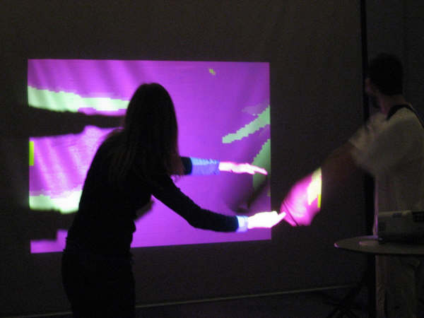
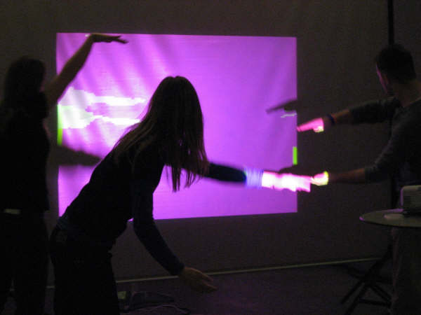
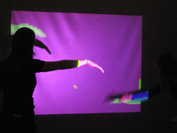
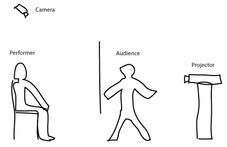
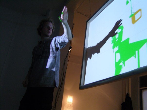
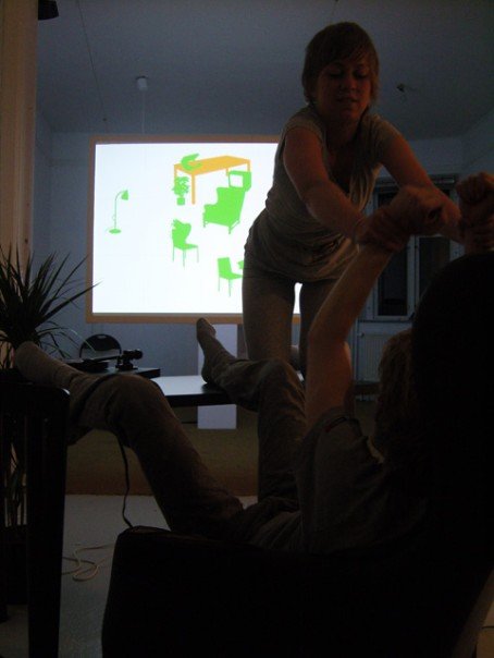
I spent most of my time in the living room however. This room is split into two parts by a large projection-screen. One side of the screen has a projector and the audience between the projector and the screen, casting shadows (right in my sketch). The other side has two performers and some ten pieces of all-black furniture. The screen shows icons representing the pieces of furniture. If the camera detects shadows intersecting with the icons, the icons are (ideally) moved out of the way, enabling the audience to move around the icons with their shadows. The performers can see this and will move the furniture to match the layout of the icons on screen. Further, the individual pieces of furniture have little narratives attached to them and the performers use these narratives and the interaction of the audience through the screen, to improvise a non-verbal play. I didn’t come up with this of course, Cameline did. But I did write the code that makes the camera-projector-screen part happen.

Technicalities
The interaction is inspired-by/copied-from Zack Booth Simpsons “Front Shadow, Translucent screen” setup. On the off chance that Zack doesn’t claim prior art, I think it should be named the “H.C. Andersen method of interaction”. Faced with the challenge of implementing the orchestration of the shadows, the icons, the projector and the camera, I first had to choose a platform and there’s plenty of choice: Processing, Pure Data, vvvv, MaxMsp with Jitter, EyesWeb and RoboRealm to name but a few. I gave each of these all of 15 minutes to prove their worth and most failed by not immediately working with my crummy Logitech webcam. Admittedly this was rather harsh, but at this point we where some ten days from the curtain call and I didn’t really have time to implement drivers or driver-bridges to cater to the exotic tastes that these frameworks tend to have (most seem to prefer fancy firewire-cameras). What did work out of the box though was Adobe Flash.
Before this project, I considered Flash a tool for lamers making annoying web-animations, sometimes rising to the the level of semi-interesting games. I figured Flash would have decent graphics manipulation libraries though and I could quickly identify a handful of tutorials demonstrating how to manipulate the web cam-input I was seeing on my screen. In the end, it turned out to be a pretty good decision — my thoughts on the matter are summarised here.
The code (click to download – let me know if you need more than the actionscript) is subtly broken in a wide variety of wonderful ways and has more magic numbers than a good-length fairy-tale. It took me the better part of 10 days to write, embarrassing considering the relative simplicity, but maybe not too bad when factoring in that I had to learn the idiosyncrasies of Flash and that I hadn’t really written any image analysing or graphics manipulating code before. When implementing the toggle for the control-UI, it occurred to me that I hadn’t handled a keyboard click-event on my own since Caltech, some three years ago.
As mentioned, the code is pretty simple. There’s a constructor that inits various bits of UI, draws a grid (used by the performers to gauge the relative positioning of furniture) and loads the furniture icons. The meat is in onEnterFrame which gets called every frame. First the web cam feed is drawn unto a BitmapData object, being flipped in the process (the camera was mounted upside down in the ceiling). BitmapData has a lot of nifty, if opaquely documented methods, reportedly written in C and much faster than whatever pixel-pushing you’re liable to implement in Actionscript yourself. One thing BitmapData cannot do however, is warp the image in a trapezoid way. The camera is mounted in the ceiling and thus won’t see the screen face on and to compensate, the image should ideally be warped. It turns that this is a minor problem for even quite oblique camera angles and since the warping code (from here) is rather slow and creates artifacts, it was discarded in the final version.
At this point, the image consists of both shadows projected by the audience and icons displayed by the projecter (along with various other cruft like irregularities on the projection screen). The software doesn’t do the intersection-analysis on this image (this would add the complication of identifying from the image the proper icon to move), but instead filters out the icons and does the hittest on just the shadows and its own internal representation of the icons. The filtering is done with a call to threshold that also transforms the various colour-values to a pure alpha-channel signal for easy hit detection using the built-in hitTest method. For this to work, the icons need to be displayed in a colour that’s lighter (or different in some other way) than how the audience shadows appear on screen.

The fact that the hittest is done on the internal state of the icons, as opposed to what is seen on screen, means that if the internal representation is not perfectly aligned with what the camera sees (and it isn’t), the interaction is gonna be wonky, ie. the systems perception of where your shadow is vis-a-vis the icons is wrong. After a bit of calibration and fiddling, the mis-alignment wasn’t too bad for most parts of the screen though and the system was pretty usable.
The rest of the code handles the moving of “hit” icons and makes sure that only icon is moved at a time (to give the performers time to relate to the new scene) and also changes the colour of the active icon to help the audience figure out which icon is currently moveable. Note that I’m using this hack to include flash UI components in the Flex project.
You’ll need a web cam to mess around with with application.
[kml_flashembed movie=”http://www.itu.dk/~friism/files/MoY/Webcam.swf” height=”240″ width=”320″ /]
So there you have it! A simple shadow-interaction system implemented in Flash/Actionscript 3.0. I’m sure my DIKU, game programming brother-in-arms Kristian is fueling his flamethrower, heading over to torch my sorry ass even before finishing reading this post, but hey!, it did the job :-). Future upgrades would include: Running the web cam feed through Resolume for fast and accurate distortion, getting proper fire wire cameras (you should use DV-cams as a minimum, they are better than web cams at correcting for poor lighting etc.) and perhaps porting the entire application to something faster than flash (to enable higher resolutions and better frame rates).
Closing Thoughts
Coding for interactive art installations is very much a question of extreme user interface design. When people go to experience art or theater it mustn’t feel like another annoying PC application they have to learn. There can be no mouse or keyboard (looks too much like “work”) and certainly no manual — the application must be immediately usable and have a very shallow learning curve. Remember that people will probably not spend more than 15 minutes looking at any given piece, severely limiting how much they can “learn”. Also remember that the audience will want to look cool and in control when interacting with the piece: People don’t to art galleries to be reminded of how bad computer interfaces are, they get plenty of that on their job.

Having said that, your code can have any number of bugs and glitches as long as they can be plausibly brushed aside with a “it’s supposed to that”. This makes for pleasant programming: You can hammer out the main concepts and get them working, leaving in all the annoying little bugs (that take hours to hunt down) for charm. In general, the audience is probably gonna be much more focused on what the installation is doing as opposed to how it’s doing it or whether it’s doing it “right”. Believe me, this seems strange when one’s spent the last few weeks poring over how to get it working and getting it working right.
Btw, if you know of a venue in Copenhagen or anywhere else for that matter, that might host the Map_of_You exhibition, please drop me a line!
Other Ressources:

